Why is Color Important in Photography?
Color is more than just an aesthetic element in photography, it's a powerful tool that shapes how we perceive and connect with an image. Colors can trigger emotion and memories of a beautiful place or sentimental event. Imagine a world devoid of color, landscapes would be bland stretches of gray, portraits would lose their vibrancy, and the emotional impact of a photograph would vanish. Let's delve into the magic of color and how to unlock its potential in your photography journey.
The Allure of Color: A Visual Storytelling Tool
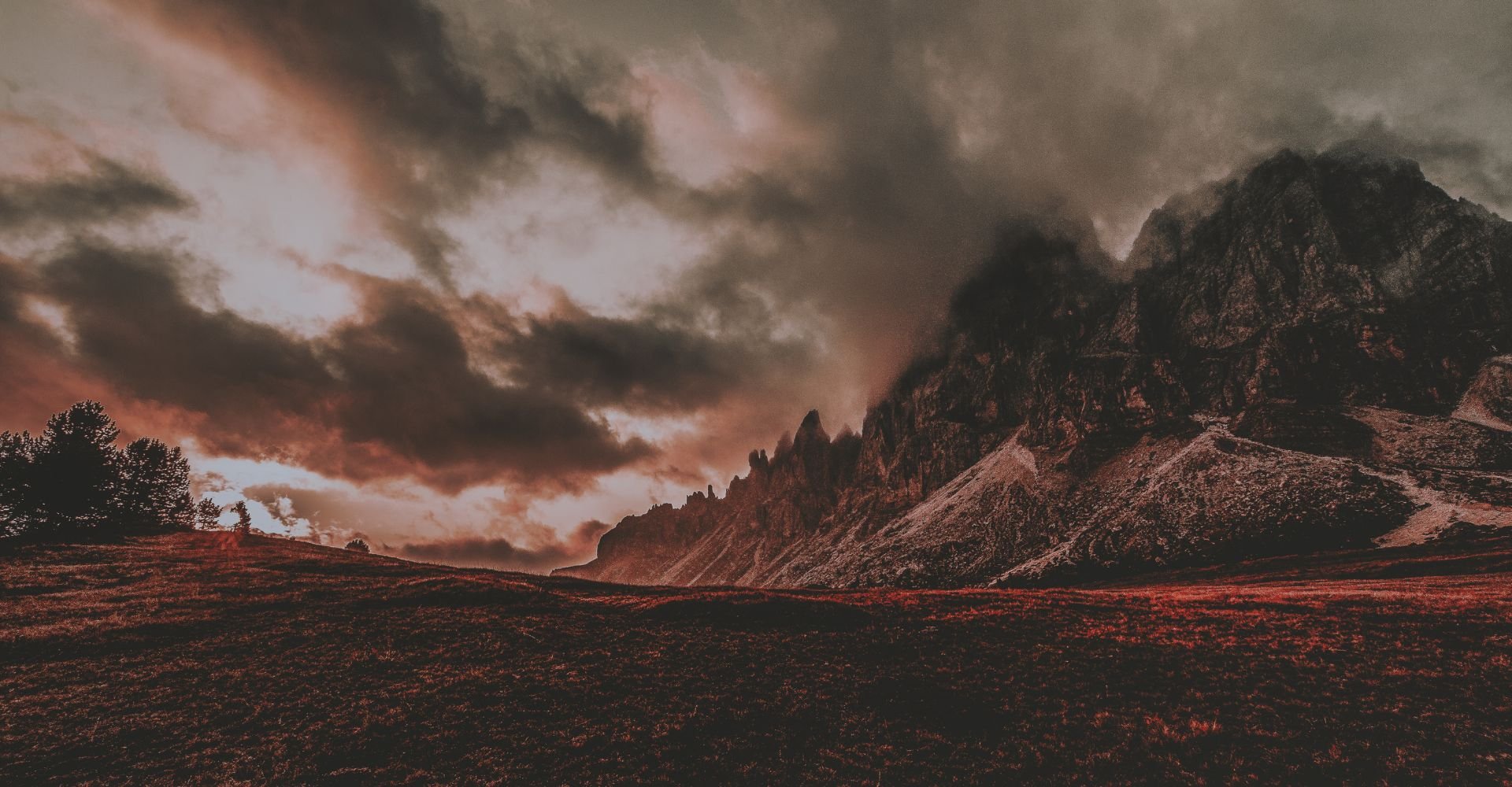
When it comes to photography, the colors present can help tell a story visually and can be used to communicate on an emotional level. There’s no denying that colors have an influence on our feelings, so it’s important to keep color psychology in mind when you’re shooting. For example, a shot of a rock outcropping or mountain lake during the warm, golden hours will likely feel more serene and inviting than the same scene shot during a gray, cloudy day which will evoke drama and mystery.
Color is perhaps the primary factor responsible for making a photo feel exciting, tranquil, mysterious or melancholic. Colors evoke a wide range of emotions; warm tones like red and orange radiate warmth and energy, while cool tones like blue and green create a sense of calm and peace. Photographers can use color palettes strategically to set the mood and tell a visual story that resonates with their viewers. The main emotions evoked by color include:
Red: Passion, anger, strength
Orange: Cheerfulness, vitality, fun
Yellow: Happiness, warmth, joy
Green: Nature, health, calm
Blue: Balance, sadness, coldness
Purple: Wisdom, loyalty, spirituality
Pink: Playfulness, compassion, sweetness
Certain colors naturally grab our attention, and by understanding color theory and using contrasting or complementary colors, photographers can direct the viewer's eye to specific elements within the frame, guiding them through the composition. Strategic use of color can also add depth and dimension to a photograph. Since photography captures light, understanding how light interacts with color is crucial. Warm light casts a golden glow, while cool light can create a crisp, blueish tone. Knowing how to "read" the light allows photographers to anticipate the color palette of a scene, and have some control over how the color in the landscape photo will look.
Using Colors Well in Your Photographs
Color can make or break a photograph. It has the power to evoke emotions, draw the viewer in, and create a sense of depth and harmony, but using color effectively takes more than just pointing your camera at a pretty scene. All the colors we see are split into three orders: primary, secondary and tertiary. The more pure a color is, the closer it is to a primary color and the more attention it will draw to itself on the image. In order to use color in photography effectively, one must learn how to create balanced color combinations or color schemes. The three most common types of color schemes are complementary, analogous, and monochrome.
Complementary colors are those found on opposite sides of the color wheel.
The juxtaposition of the two hues results in a bold, vivid contrast, and colors that are complementary inherently balance one another.
Analogous color schemes use adjacent hues on the color wheel. They’re usually based on a primary color that serves as the connection between them. The lack of strong contrast between colors results in images that feel balanced and calming. Analogous color schemes are often found in nature, which makes them especially popular in the field of landscape photography.
Monochrome color schemes refer to any composition that uses only a single hue with variations of its tones and shades.
Understanding color theory arms photographers with the knowledge of how colors interact with each other. For example using complementary colors can create a vibrant and dynamic composition, while employing analogous colors creates a sense of harmony and flow. Each color has a wide range of tones and shades, which transform a basic color wheel into the complete palette of the 10 million colors humans can see. Each of the unique colors has a specific tone, and shade, which are determined by the color variables of hue, saturation, and luminance (HSL).
Hue is a name we give colors on the color wheel, and is displayed in degrees ranging from 0 to 360 referring to the radial position of a color on the RGB color wheel.
Saturation refers to the purity or intensity of a color on a scale from 0 to 100. The lower the saturation level, the closer the color is to grayscale.
Luminance, also known as brightness or value, determines how bright or dark a color is and ranges from 0 to 100, with 0 being black.
Color is the lifeblood that breathes emotion, depth, and meaning into an image. By understanding color theory, mastering the technical aspects, and employing creative color manipulation, photographers can elevate their craft and transform an ordinary scene into a captivating visual narrative. Even after the shutter clicks, the color story can continue in post-processing. Editing software allows photographers to fine-tune colors, adjust vibrance, and create unique color effects, all while staying true to their artistic vision.
Ready to get outside and test your skills? Our guidebooks offer photography tips, recommended times and spots, as well as location-specific insights, like parking and trails, all aimed at ensuring you can focus on taking epic pictures and not get tied up with logistics.

